Danone

Gruppo WISE for Danone, Mellin and Nutricia: the B Corp message takes on strength and colour.

What is a B Corp? Danone teaches us this, with the help of Gruppo WISE.

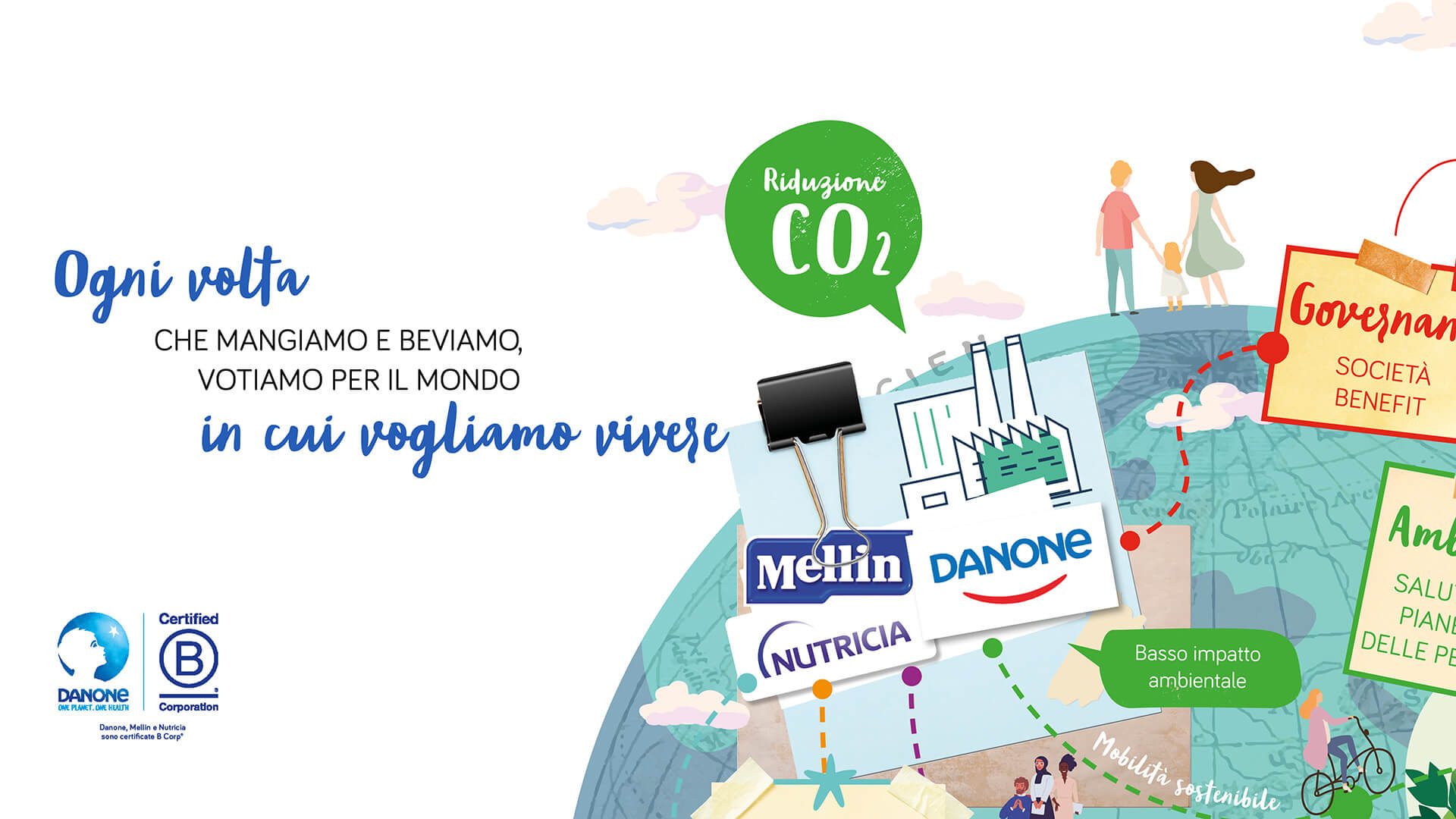
Business and sustainability can go hand in hand: B Corp companies produce positive effects on the environment, on the territory and on people, without neglecting their common goal: to use business to promote social and economic development.

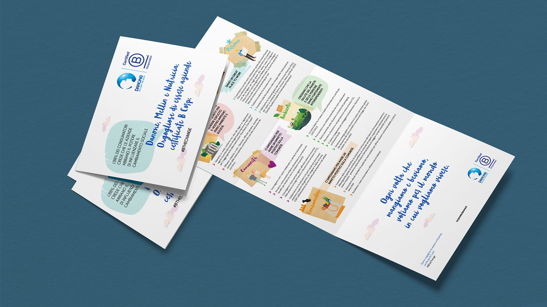
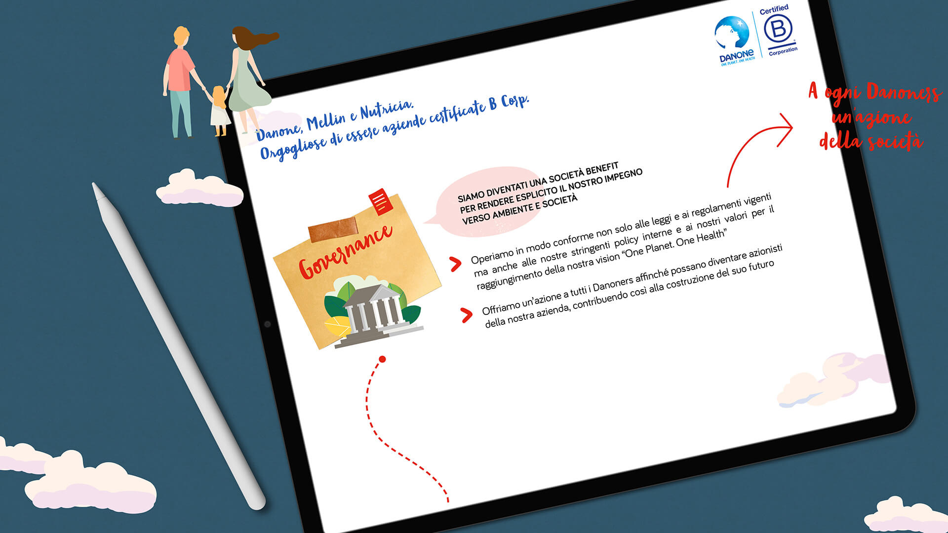
To get straight to people’s hearts and explain the complex and wonderful way of acting of B Corp, Danone, Mellin and Nutricia – benefit companies with B Corp certification – have entrusted the Gruppo WISE with the development of this special and very important piece of their internal and external communication.

Read more

COPYWRITING
The team’s first job was a precise and accurate analysis of the contents, to then proceed with the drafting of simple and effective texts that were able to best express all the goodness of this prestigious certification earned by Danone, Mellin and Nutricia.

After analyzing the four reasons that made it possible to achieve this goal – protecting the planet, promoting health, enhancing people and building trust – the copy that accompanied all communication media was developed.

The texts studied for the project support and give value to the very strong claim of the campaign – provided as a guideline from the first brief – which expresses, with simplicity and effectiveness, all the strength of the message: “every time we eat and drink, we vote for the world where we want to live”.

The call to action is implicit, but at the same time very clear: by choosing to buy from a B Corp company, you will help improve the planet, now and in the future.

The reassuring, familiar and direct tone of voice completes the picture of a message that goes straight to the head and heart of consumers.

STYLE AND TOOLS
The style of communication studied by Gruppo WISE’s graphics team is in line with that of the company, with the addition of an unprecedented and unusual boost. The mood of the collage on the illustration of the planet earth guides the message; the perfect mix of images, texts, icons and photographs explains the contents easily and clearly, in a fresh and innovative way, characteristics that have always distinguished the communication of the companies of the Danone group.

All perfectly integrated with the palette chosen by Danone for the project, dominated by pastel shades, but guided at the same time by five precise colour codes, one for each B Corp impact area: red for governance, blue for people, purple for the community, green for the environment and orange for consumers.

The infographic, which guides all social communication relating to the B Corp theme, has been transformed into a “poster” and inserted in the dedicated section of the website.

An information brochure for external / internal use and a presentation in PPT were also created with the contents developed by Gruppo WISE.

CORPORATE IDENTITY
ILLUSTRATIONS