Olio della Preara

From nature, a concentration of style and elegance for the Olio della Preara.

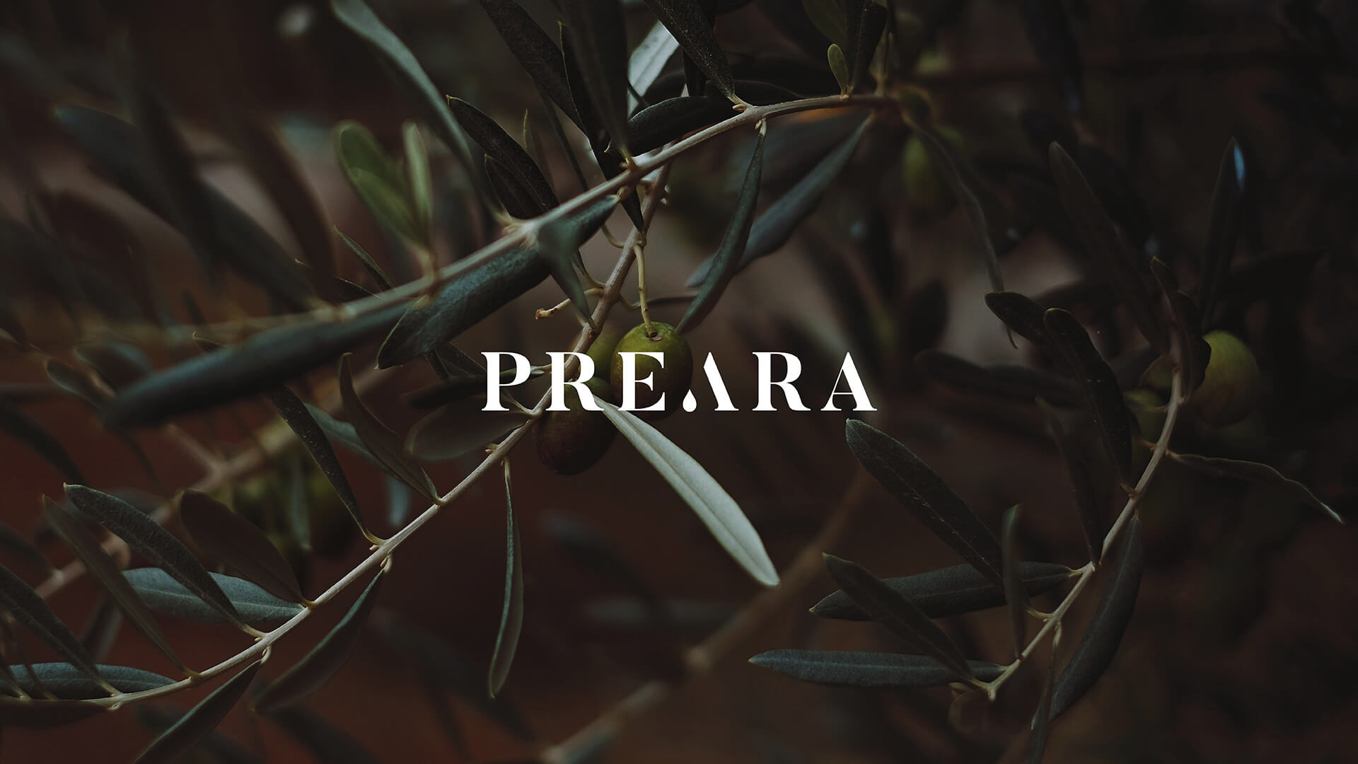
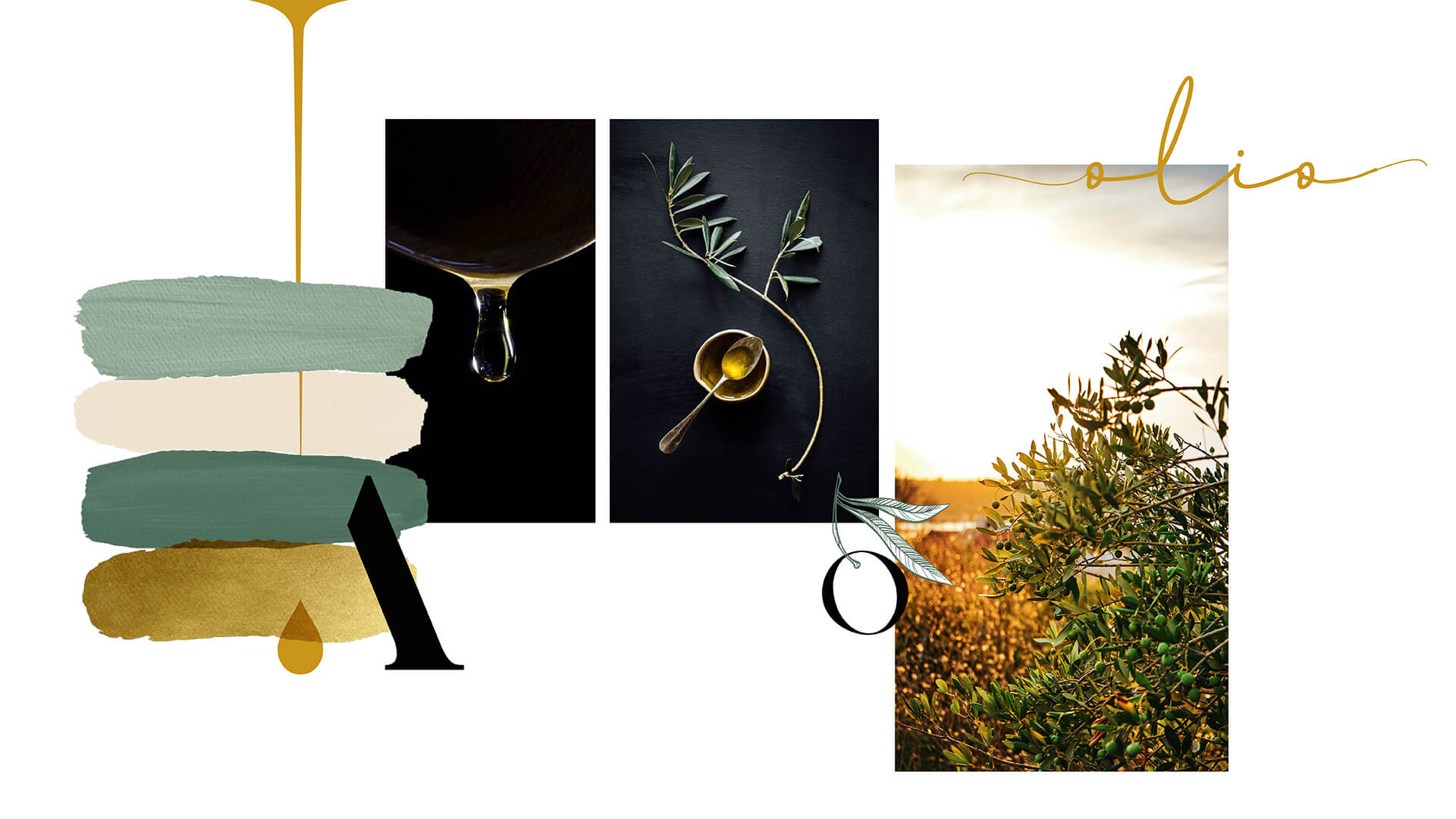
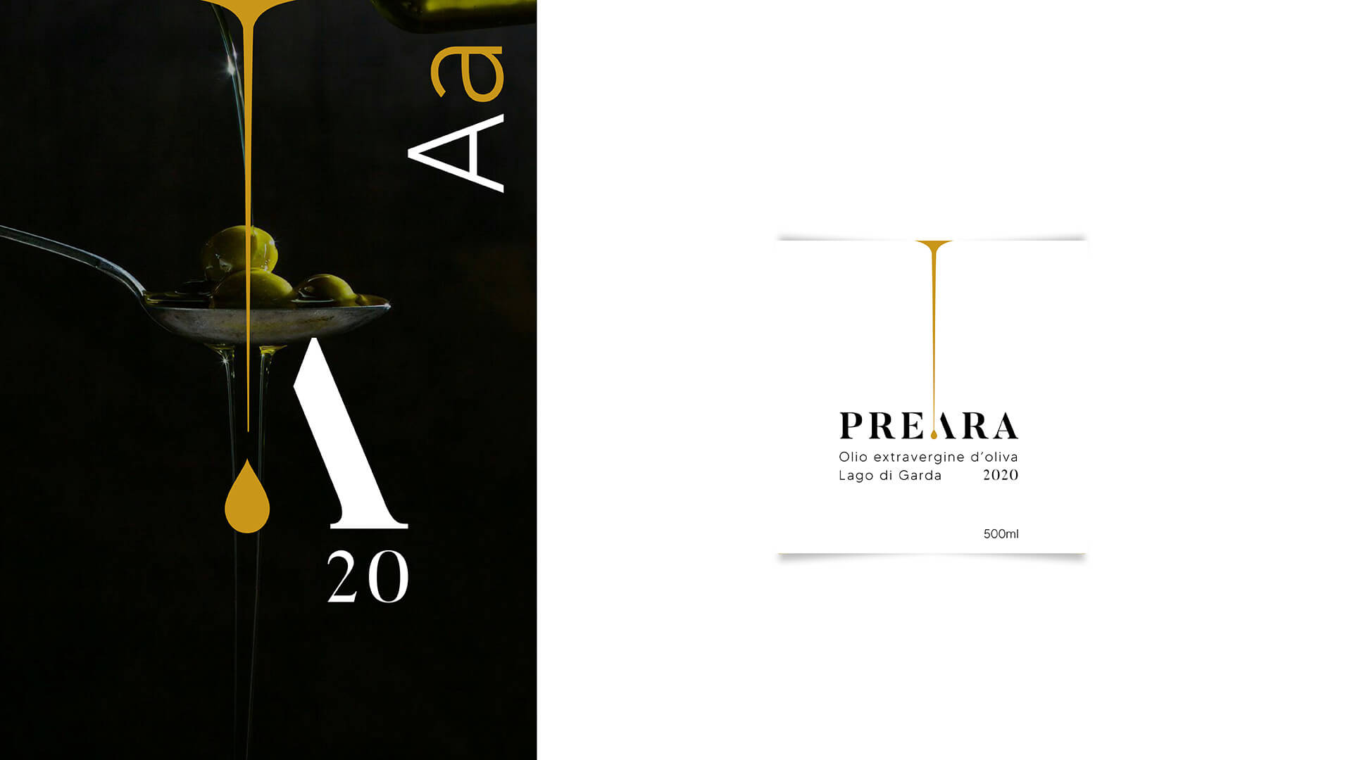
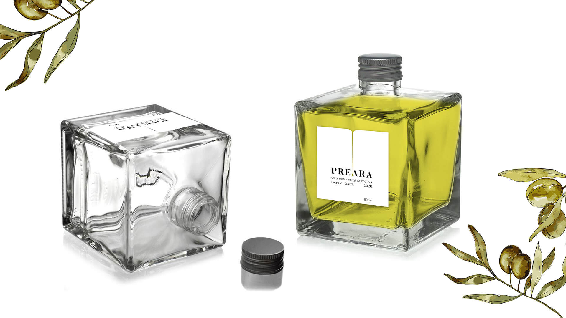
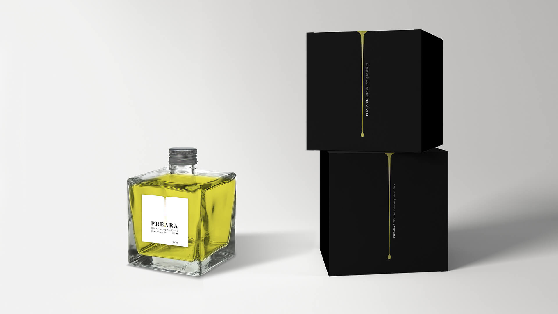
Elegance, essentiality, style and refinement. Olio della Preara wants to express these values, not only through its own unmistakable taste, but also through its own image, and emanation of the characteristics that distinguish it.

Gruppo WISE took care of the entire product image, placing two fundamental aspects of communication in the hands of the team: the logo and packaging.

Read more

Logo
Precious, like the gold that characterizes the drop that completes the first A of the naming P R E A R A.

Elegant, like the font that characterizes Preara, the wonderful area of ​​Lake Garda that welcomes the olive groves.

Exclusive, that counts on the production of very few bottles and which enhances even more the family context, a limited edition that represents a real special edition.

The logo incorporates the distinctive features of the brand with strength and character, making it memorable and immediately recognizable. The colour palette that accompanies the image is inspired by the tones of nature, the shades of green of the olives, the yellow of the sun that makes them mature and the gold of the nectar that comes from their pressing.

Label and packaging

Elegance and refinement are also found in the bottle design which presents the product. A transparent cube that winks at the design that recalls the shape of a perfume pack.

The sophisticated and clean label shows only the essential information: brand, place and vintage.

“Lake Garda”, is highlighted in order to underline the prestigious origins of the Preara olive groves.

White, black and gold are the guiding colours.

Finally, a look at the packaging, an opaque black cube made with soft touch paper that incorporates the element of the drop in the visual part, made precious by a hot-stamped golden foil.

LOGO
PACKAGING