Logo, brand image, new visual and claim. The “future direction” of the OPS company has been entrusted to Gruppo WISE, which has designed the new coordinated image of this historic and international company. For 45 years, OPS has specialized in the production of high pressure die-cast aluminum components for the automotive industry and has been able to offer the market a wide range of products and services.
OPS Automotive
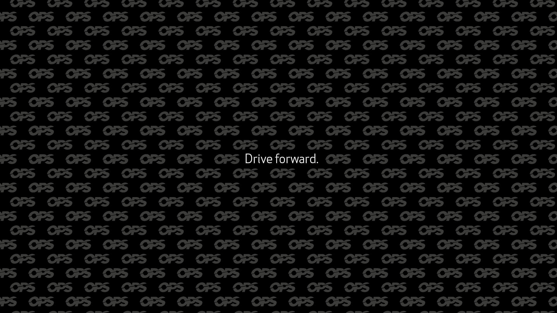
Drive forward. Gruppo WISE signs the integrated communication of OPS Automotive.
The use of the most modern technologies, the strongly future-oriented approach, the special attention to the constant improvement and the training of people are the launching pad of this company. Gruppo WISE used all of this as its starting base for its communication project.
Logo restyling
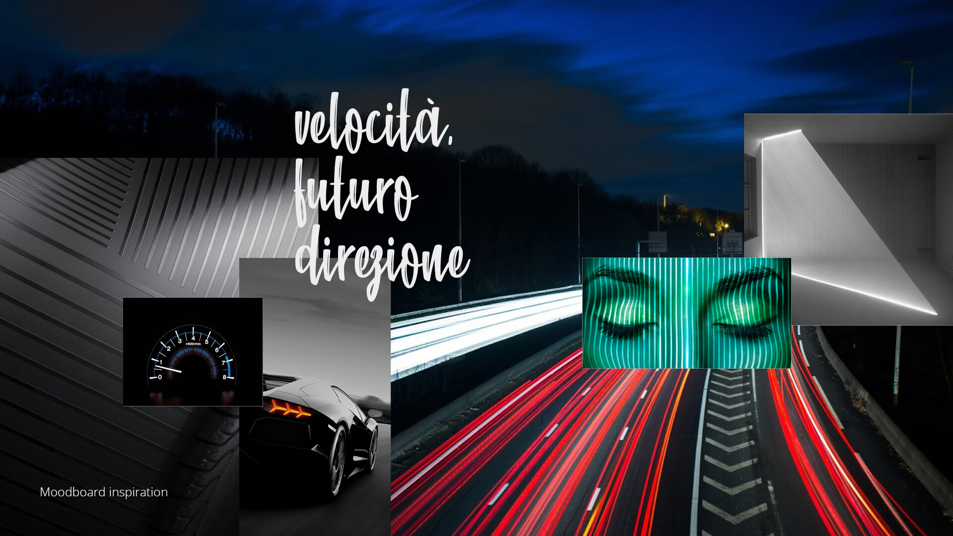
The concept conceived by Gruppo WISE for OPS can be summarized in “Future direction”.
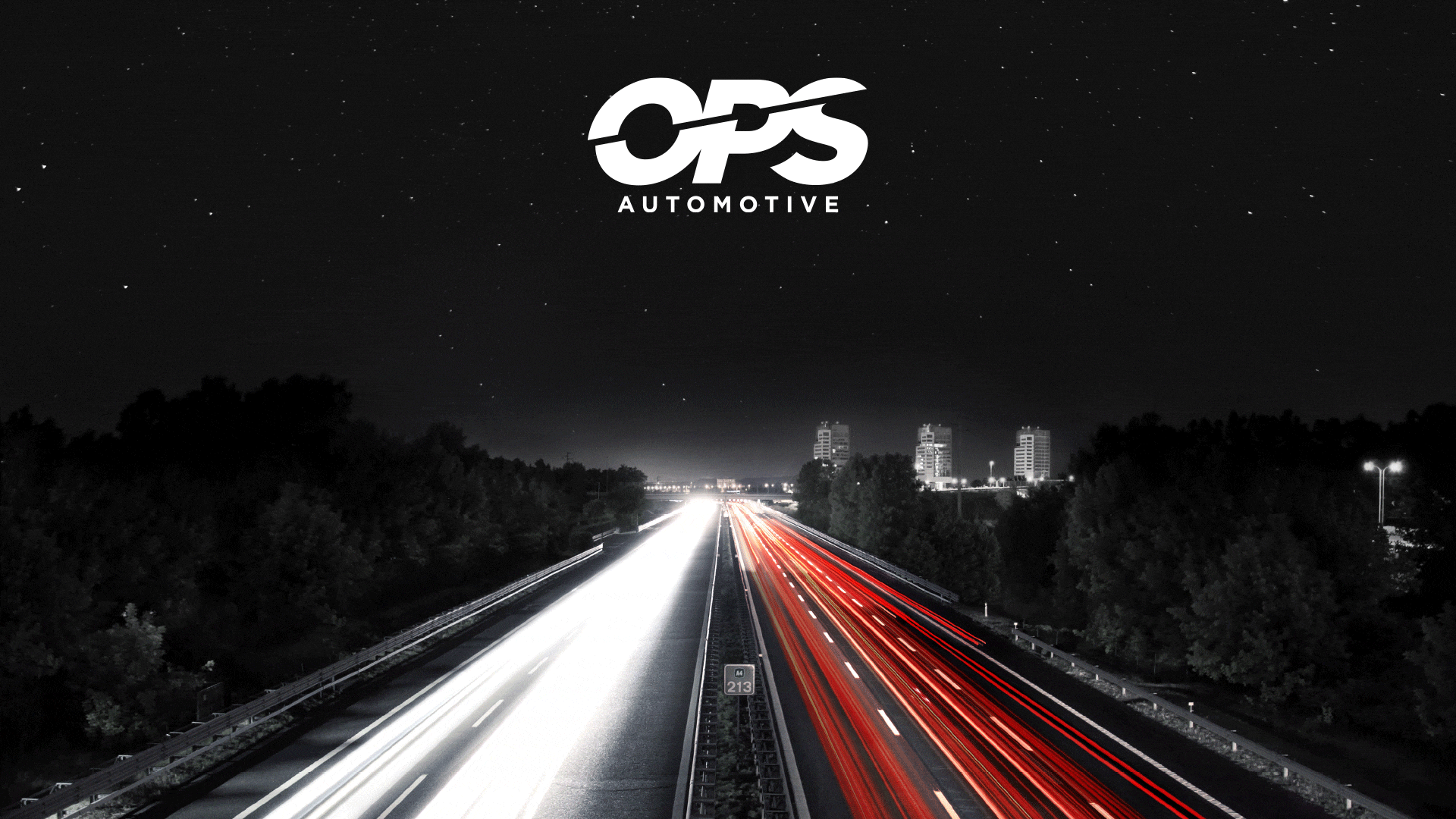
Speed and orientation towards the future were in fact the concepts that inspired the creation of a logo designed to express the current identity of the company. The overcoming of the past and the push towards new challenges are the two elements that coexist in the lettering, crossed by a dynamic and decisive cut, made even more propulsive by the letters inclined to the right. To complete the logo, the new “automotive” payoff was defined as a direct expression of the corporate sector.
Brand Image
The brand image and the consequent corporate coordinated image came from the logo.
The graphic team of Gruppo WISE, gave life to the new graphic texture, through the use of colour and lettering thus composing all the main elements of the new OPS image.
The Claim
The last step to complete the corporate communication was the creation of a claim and a visual, which would strengthen the company’s image and become representative of OPS and at the same time convey its values.
This was how “drive forward” was conceived.
This English expression literally means “going forward” and expresses multiple meanings in one phrase, from the clear and direct reference to the automotive sector, and to the most figurative sense of dynamism. Drive forward also has a strong proactive meaning, given that it carries the sense of pushing something forward, of leading towards the future: a concept that well represents the evolution and new course of the OPS company.
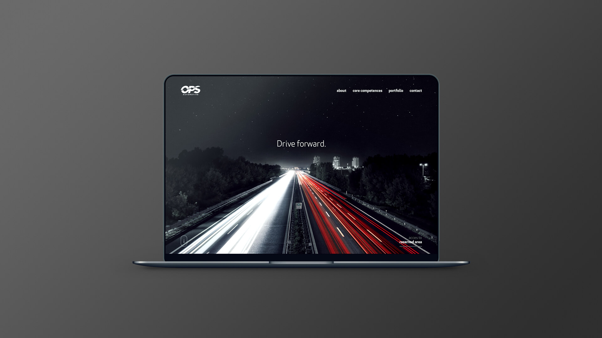
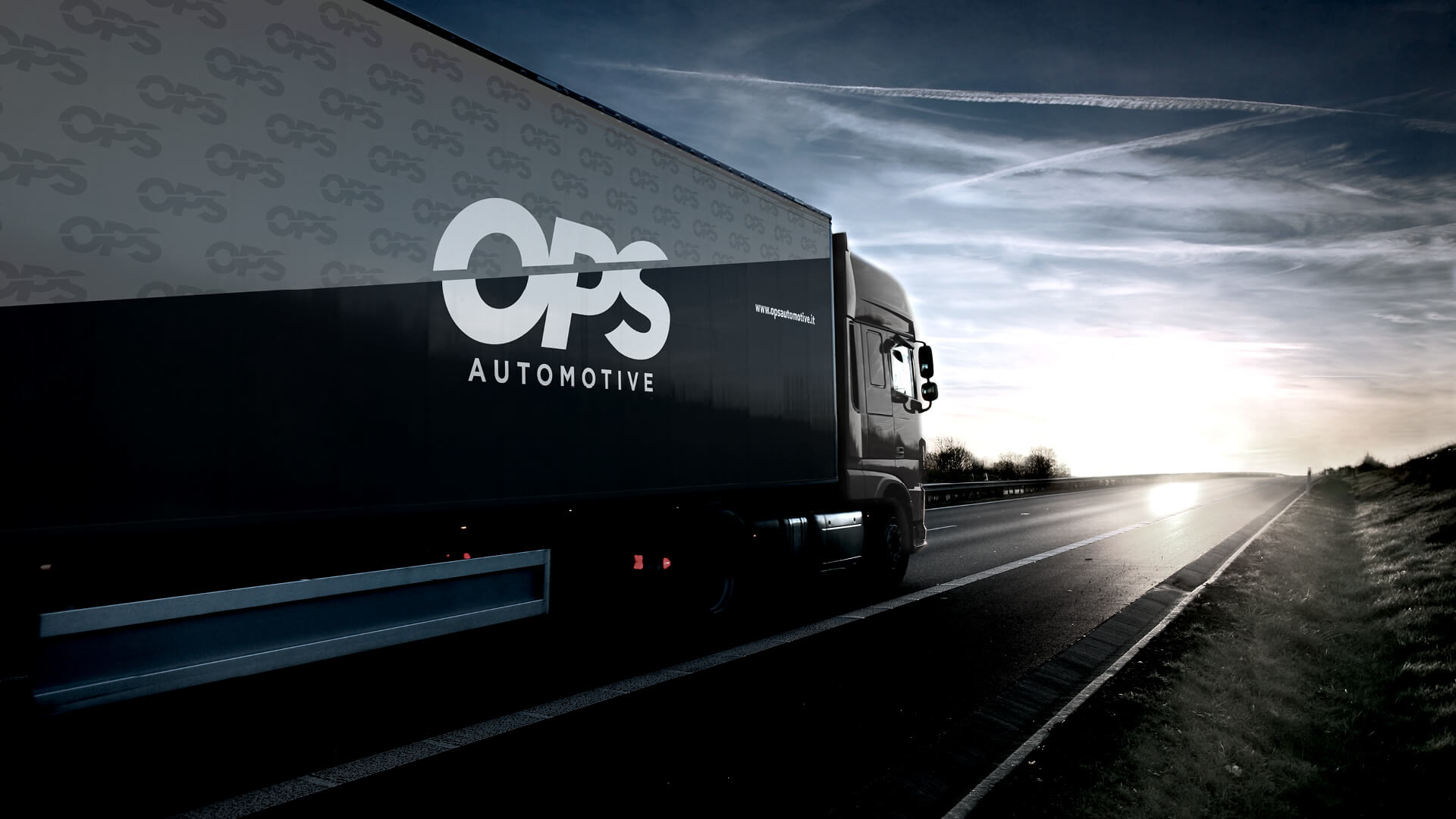
The background of the image associated with the claim, linked to the business sector and speed, has Brescia, the city where OPS is based, as a protagonist, to express a sense of belonging and territoriality. The image thus created has become the symbol of OPS.
Communicative use
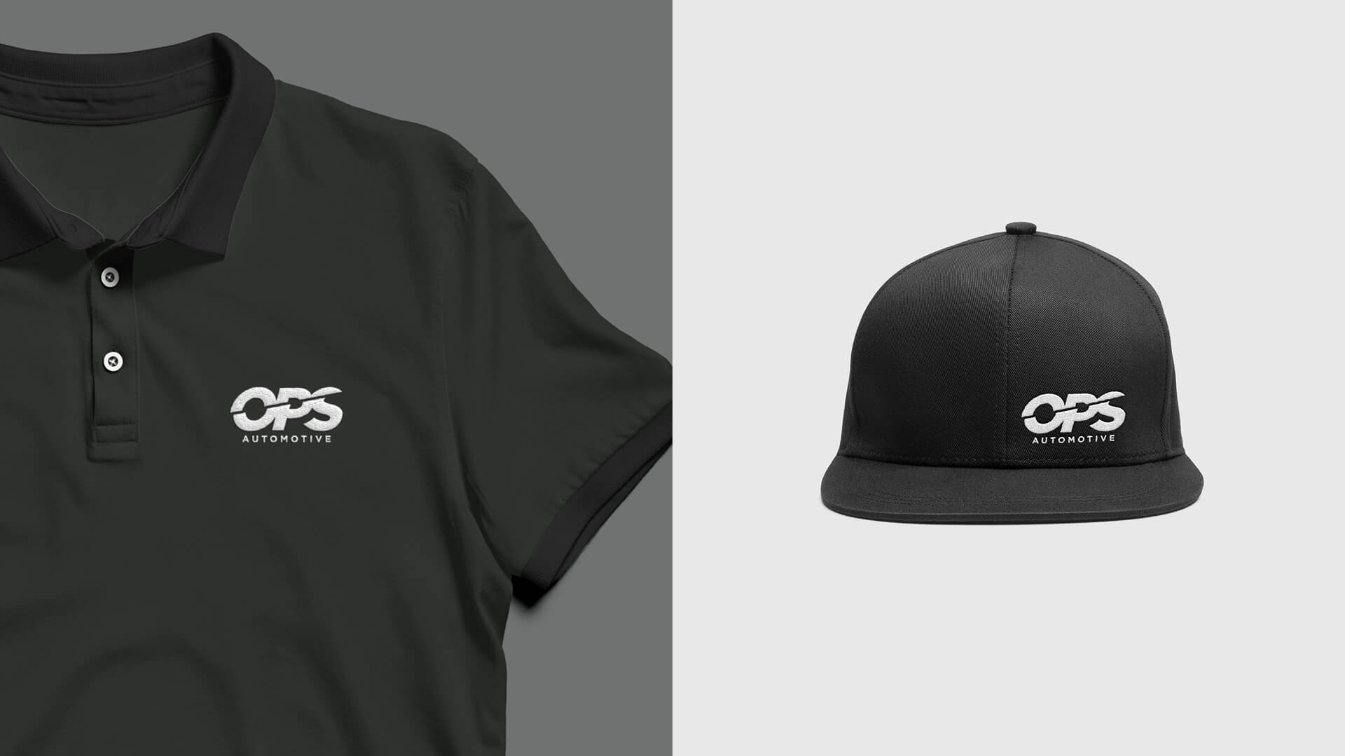
Logo, visual, image and claim have been used on all company media such as headed paper , envelopes, business cards, notebooks and on new communication tools. Using the brand image guides and making reference to the key words of the project such as speed, future, direction, table calendars and tickets for celebratory occasions were also created. Finally, this new integrated corporate image was the basis for the design of the stands used by the company at international fairs, thus transforming a simple space into a strong and direct message.
ADVERTISING
CORPORATE IDENTITY
FAIR
LOGO
WEBSITE
Share on