Dynamitick, among the first companies in Italy to have spread dynamic pricing, expands its market and becomes Premoneo. Gruppo WISE has accompanied the company in this evolutionary process, step by step, as a strategic partner in the creation of the entire integrated communication project of the new Brand.
Premoneo
Dynamitick becomes Premoneo: WISE Group strategic consultant for the new Brand.
The client
Premoneo is the result of a business evolution that led the start-up Dynamitick, owned by investors such as LVenture, Boost Heroes and Wylab and specialized in dynamic pricing, to expand its market and business. On the strength of the results obtained over the years – in which it has become a dynamic pricing provider for over 50 customers, boasting an average annual growth of 28% – Dynamitick has evolved its business and its market, thanks to a new Artificial Intelligence software that allows companies from different markets to digitize pricing, forecasting and segmentation activities.
The project
In this evolutionary process, the Dynamitick Brand, a union between Dynamic and Ticketing, no longer represented the company that today has expanded its reference markets to include Retail, Transportation, Logistics, Banking, Insurance and Energy and diversified its main activities. Hence the need for a new Brand Image and a new communication strategy that would transform the start-up into the complex reality it is today. Throughout this process, the company has relied on the strategic consultancy of Gruppo WISE which has accompanied the customer in their communication and image choices.
Branding
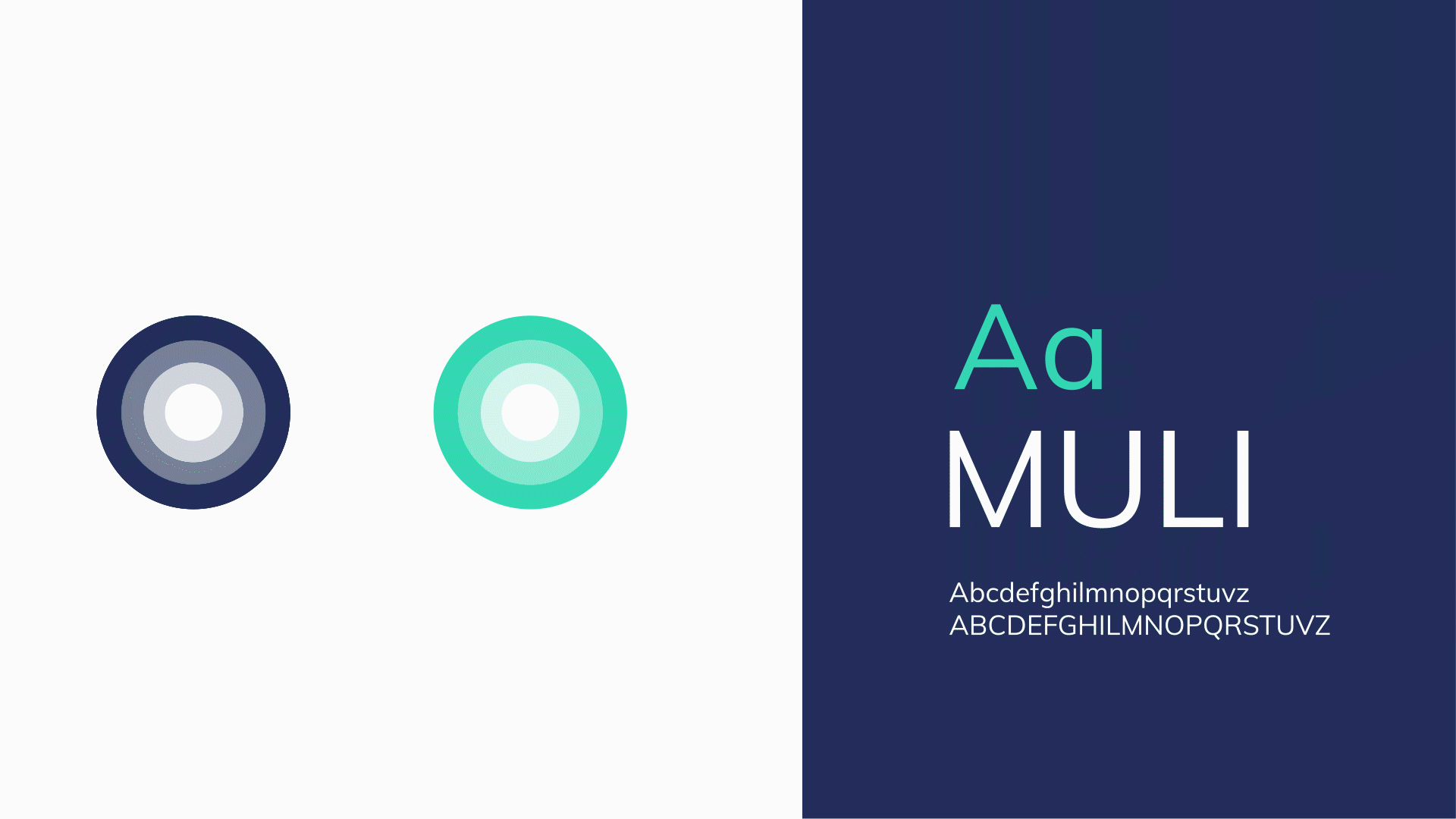
To position the company in its new reference market, a brand was studied that was able to express the essence of the new reality and give it the right positioning. Gruppo WISE then took care of the conception of the new name, the payoff, the logo, the Brand and the new image.
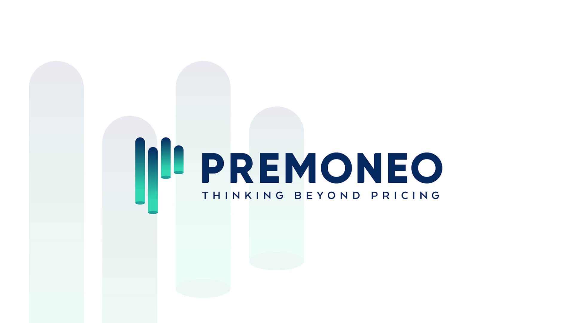
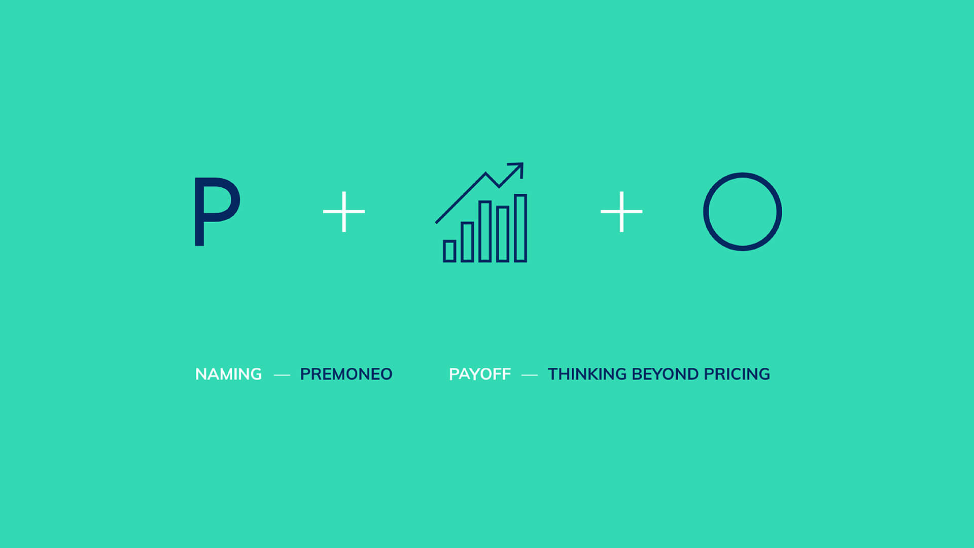
Naming Premoneo recalls, in its prefix, the predictive capabilities of technology, and in the Latin root “monéo”, key concepts of the ways of supporting customers: forecast, warning, advice. Finally, the assonance with the English term “money” recalls the main objective of the company: to support the growth of the profitability of its customers.
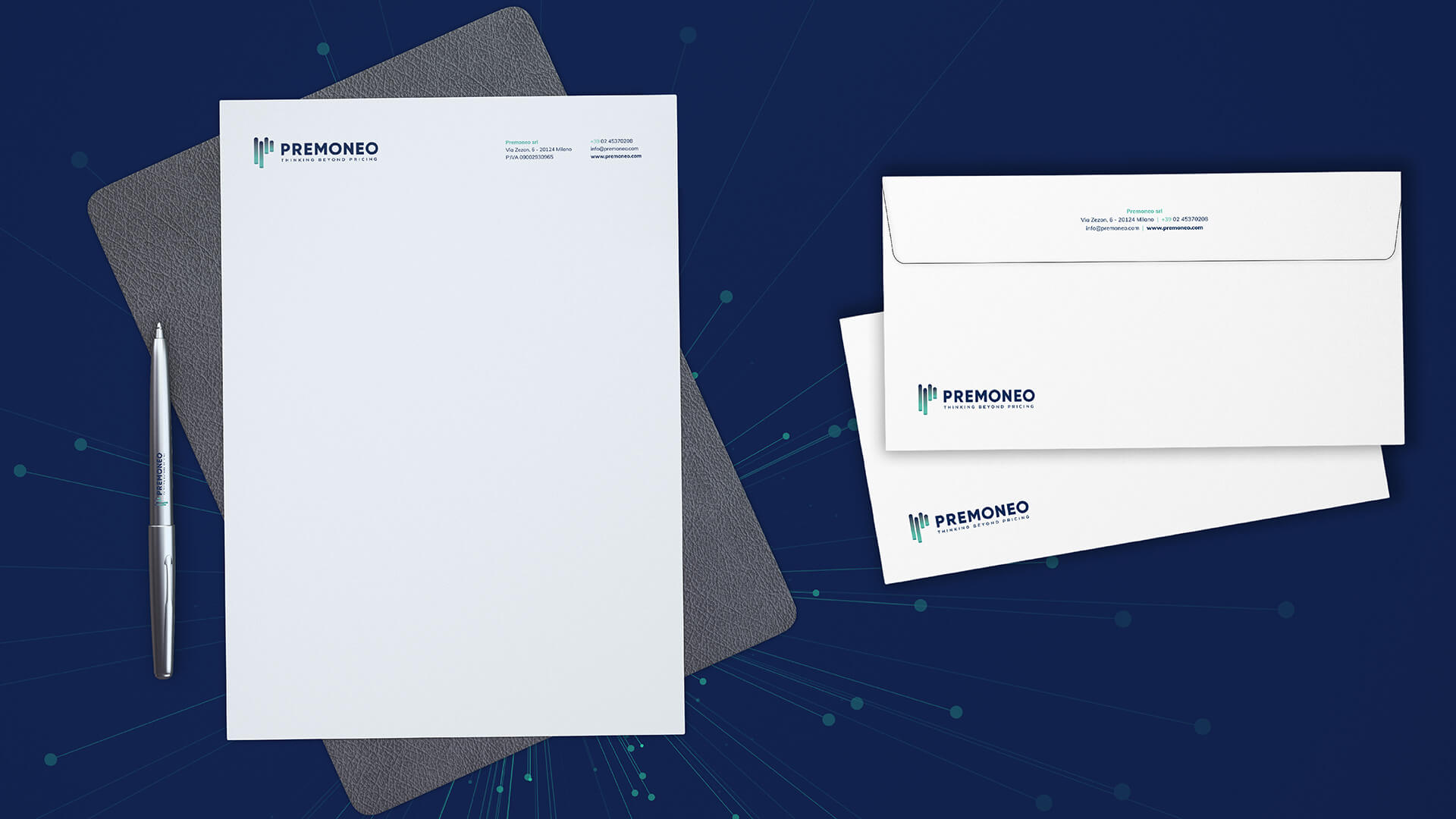
The pictogram summarizes in the initial P the typical iconography of graphs and displays of price trends and fluctuations; the institutional colours strongly recall the technological and digital sphere and the nuances inside evoke the dynamism and evolution of both the company and the markets followed.
The logo carries with it the “Thinking Beyond Pricing” payoff with a smart, current and direct tone. Its definition originated from two needs: to define the operational scope of the company and communicate the plurality of services offered. The reference to Artificial Intelligence with the verb “Think”, evocative in the IT field, declares the intent to look beyond the definition of the right price, supporting companies in the management of activities such as forecasting and segmentation, similar but beyond the boundaries of pricing .
CONSULTING
LOGO
CORPORATE IDENTITY
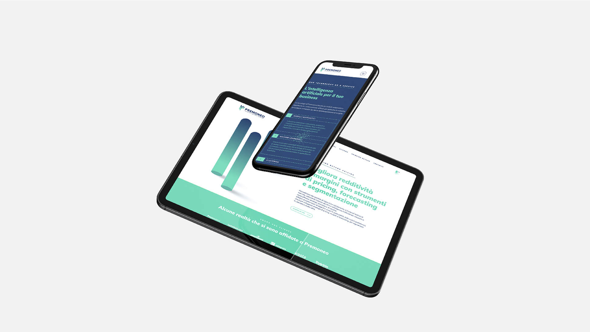
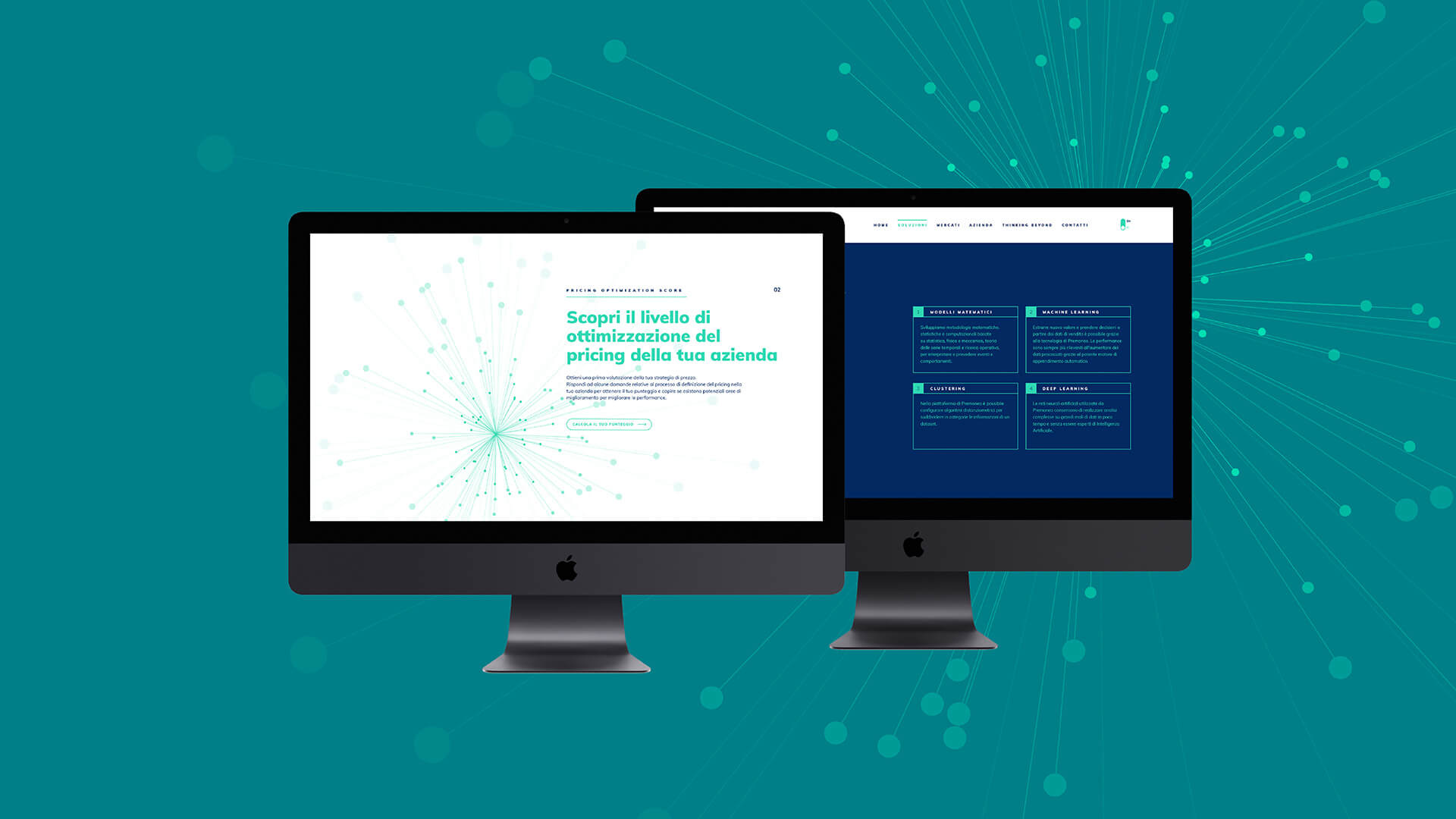
WEBSITE
Share on